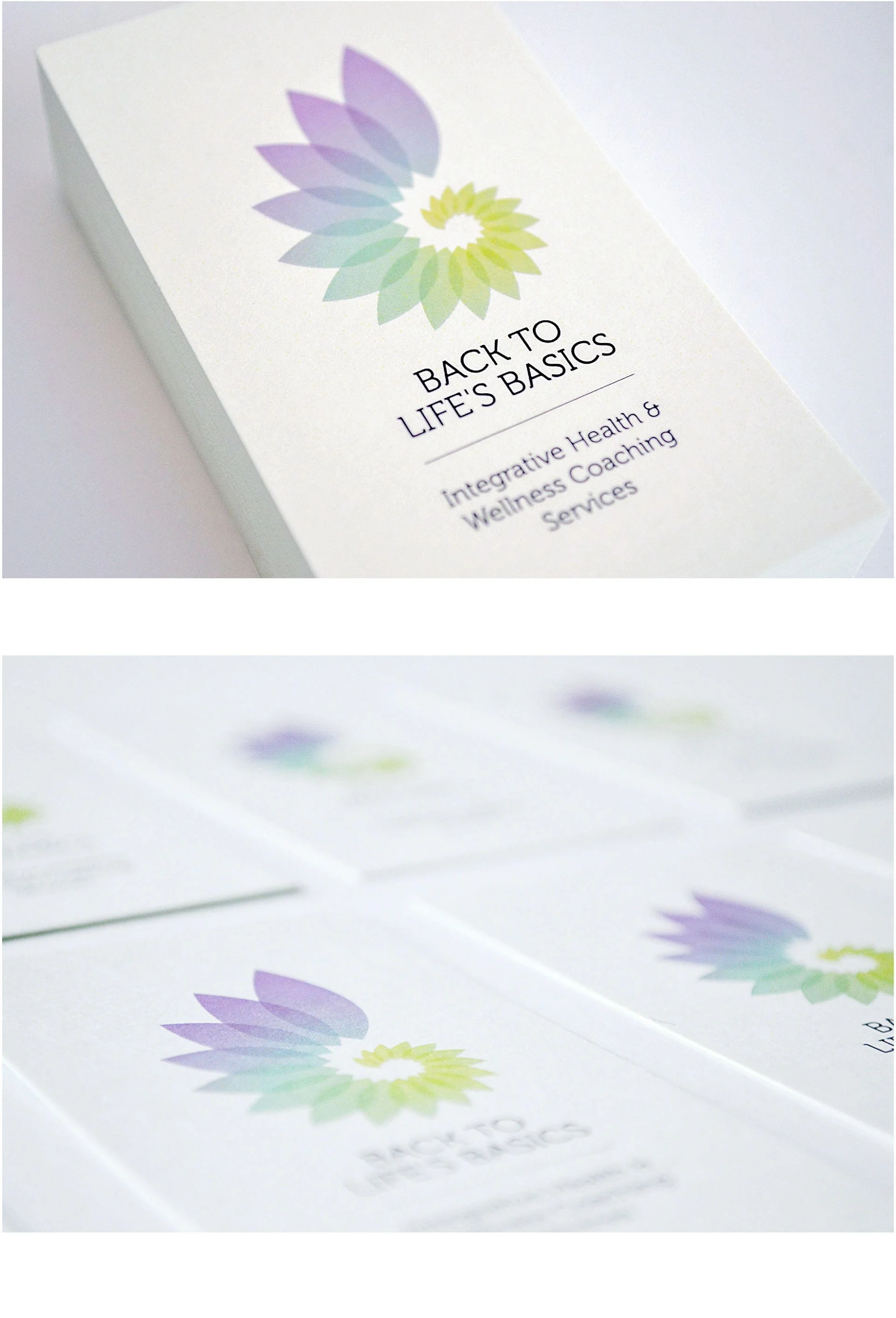
When I first met with my client, I asked her what she wanted Back to Life Basics to be known for. Her vision was clear: something easy to remember, knowledgeable, and holistic. We decided on clean, detailed icons paired with a refined typeface, and a soft pastel color palette that felt fresh and approachable.
The result was a brand identity that is simple yet expressive, feminine, modern, and uplifting. I designed a series of icons to represent connection, communication, and diverse approaches. This process also led to the creation of a distinctive brand mark, which came together naturally and with clarity.


